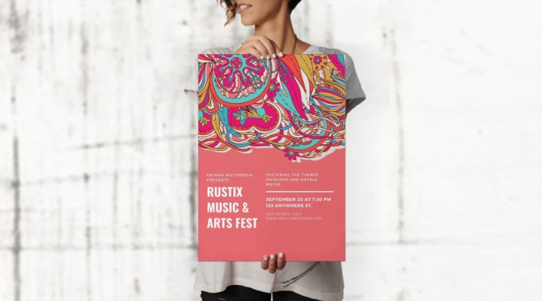
If you’re in marketing, you’ve probably tried and tested a whole bunch of advertising techniques. From digital marketing to social media strategies to dynamic signage displays, you’ve likely heard of and done it all. But you also probably know that, despite all the modern changes in the world of marketing, nothing really ever beats the power of a good ol’ fashioned poster. The QR code has existed for almost 30 years and new uses are being discovered for them all the time. One such use is in advertisements as it can be an easy way for consumers to connect to a business website. For help making your own QR codes, consider using this free QR code generator.
Posters are timeless. They can be used for anything from brand recognition and awareness to promoting special sales, upselling products, and so much more. And you can use them both online and offline, which works out great for all sorts of audiences.
However, there is one catch. A poster might work well, but it needs to be super eye-catching and attention-worthy to do so. You need to add the right colors, imagery, and content, and make it fit the right format. To get you started, here are some great design tips on how to make the ideal poster for your advertising campaign.
1. Pick the right colors
The first thing to do when making a poster is to choose the color scheme. The color palette essentially forms the background of your poster, and could potentially be the most eye-catching factor.
The ideal color scheme for your poster would be one that matches your brand image as well. For instance, if McDonald’s is advertising a new value meal, they’re probably going to use their signature red and yellow colors to promote it. Your brand colors help with brand recognition and will encourage customers to automatically associate a poster with your company.
With that being said, don’t be afraid to add a couple of other fun colors into the mix. You can have your brand colors as the main factor in your poster, but you can definitely make it more vibrant by adding some bright shades in smaller factors, such as the imagery or animation. Read more about How Many Types of Logo Designs Are There?
2. Choose an engaging font
When designing a poster, you go in hoping that the customer will automatically be hooked to whatever subject line or header you’ve printed on it. But the truth is, customer engagement toward a poster is very heavily dependent on the type of font you use. And the font you choose is, in turn, dependent on what you want to say.
If you’re advertising a sale, you want a big, bold sale sign right at the top of your poster, preferably in a thick, readable font. On the other hand, if you’re selling luxury items, you’d like a smaller, cursive font that shows a bit more sophistication and goes with the overall image.
Choose a font that goes well with your message. Make sure it’s visible enough for everyone to be able to tell what the poster is about and keep it relevant to your overall message.
3. Don’t overload with content
When you’re advertising something, you want to give out as much useful information about it as possible. You might want to brag about all the extensive benefits of your product or talk about its long list of features, but no one has time to read all that. The average customer will, at best, give your poster a quick skim before deciding whether to keep it or toss it away.
Overloading your poster with unnecessary content can make it look overcrowded, and can lose reader interest pretty quickly. If you want people to stay engaged, stick to a few precise but useful details. You can add one top feature, one great rating or review, and one amazing benefit to give customers a taste of what your product consists of. You can also add a QR code in a corner to lead customers to an online site or page where they can find out more information.
4. Add some fun imagery
No poster is complete without images and visuals. Imagine getting a poster with just text on it. You’d be bored pretty quickly too, right? The rest of your customers would be too. So make sure to add all the right images to your poster.
Make sure your visuals are relevant to your poster content. If you’re promoting a restaurant, some aesthetic food shots might work great. Or, if you’re promoting a day-care service, try out some shots of yourself playing with a bunch of kids. Remember that imagery not only adds character to your poster and helps with engagement, it also acts as an indirect testimonial for your claims.
Start making posters today
The ideal poster can take a lot of time and effort to perfect. And reading all of this might have got you thinking about all the possible customization costs involved. But don’t worry. With online design tools, you can easily make an online poster maker, you can get free access to a wide range of poster templates that you can customize according to your needs. With design tools like that and tips like the ones above, you’ll be able to level up your marketing game in minutes.

